Hi Everyone - wishing you all a good outdoor/bicycle season this summer!
To make your biking and outdoor activities even better - I invested a lot of time - partly together with a graphics designer - to improve the layout of the maps regarding to making them nicer to look at. Previously I had tried to design all elements so that they are easiest to distinguish - that however caused the some not so important things - like the differentiation between industrial or residential quarters to stick out too much - while for most people the main importance is if you are in the nature or in a build up area. It's still easy to distinguish between shopping, industrial or residential quarters - but the different places don't pop out of the screen anymore - leaving better contrast to streets and trails - so things that really matter. I also made buildings much more similar - I think the old differentiation between simple buildings and those with touristic or public usage was not as important as to make them a darker grey. Landfills are now moved to show only at very high detail - they showed too early.
Also for all layouts residential streets at resolution 23 (300m) are now shown identical to resolution 24 (200m and below) - I did this to save some screen estate in resolution 23 but I think it's too confusing - increases the learning to read the map too much.
The second big change is an addition of a more standard Topographical map layout. It does not show any information that you would not expect in a normal topographical map for hiking - so it is much easier to read. I therefore also made mtb, bicycle and hiking routes much thinner. They are still visible but much less obvious. It's very simple - tracks get red colour, pathes (singletrail) get brown colour. The more dashed the harder/more difficult/worse condition. There is no more differentiation between residential roads and service roads or tracks with tarmac surface (this differentiation is still visible in the hiking layout) as standard topographical maps also do not differentiate this. An exception to this I made with pedestrian zones - they are in most maps not differentiated - but I kept a differentiation for them. I am thinking about modifying the hiking layout a bit therefore - maybe remove all mtb routes and bicycle routes from it? I usually think hikers like to know them too - but in that case they could use the new simplified topographical map layout which is not specific to one activity.
The simple topographical layout also exists for the VeloMap.
Some more changes over the last weeks: add leisure=track for bikeparks where highway=path is not used (happens sometimes), Fixed a bug that ways with route=hiking were shown dominantly in the VeloMap (so you could assume they have better surface - only applies to ways with unknown surface/tracktype/smoothness). Place=locality POI moved from resolution 23 to 24. They are sometimes used excessively.
Oh and if you are unsure which layout to use: I've added a section explaining this to the website: https://www.velomap.org/velomaporg/map-legend/
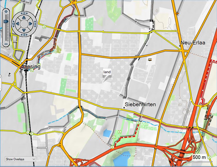
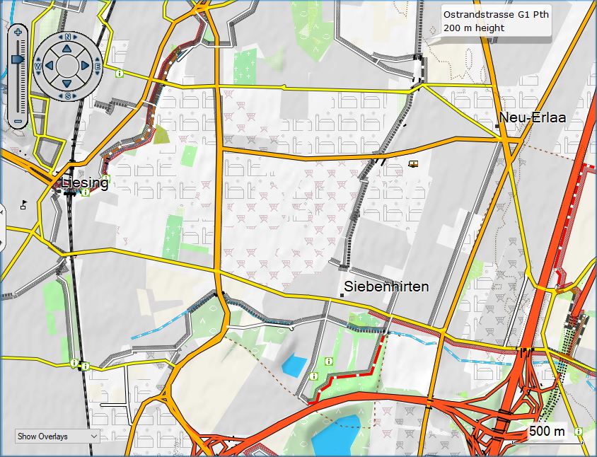
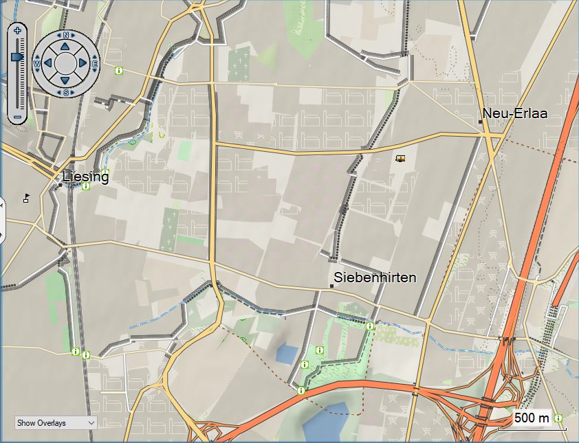
So here some screenshots showing the changes:
The new cleaner layout - OpenMTBMap Wide layout (very similar for VeloMap Wide):
vs the old Wide layout:
The same was done for the desktop layout (I first thought about removing it altogether - because the new layouts are quite nice on desktop too - but yeah desktop layout with lower contrast is still nicer on desktop:
- so the new desktop layout below.
I still have to do some work in implementing those changes for the Fenix layout.
Now on to the new Simple Topographical map layout:

vs the Hiking layout:
vs the wide layout:
And here another screenshot of the new simple Topographical map layout:


Hallo zusammen,
ich habe das aktuelle Kartendesign für den Edge 1040 und für kleine Bildschirme aktualisiert. Es basiert auf dem aktuellen Design vom September 22.
Die Strassen sind fetter, die Flächen cleaner und Einkaufsmöglichkeiten sowie Wasserstellen hervorgehoben.
Mir nützt es sehr und auf den kleinen Bildschirmen ist es nicht mehr so überfrachtet.
Viele Grüße, Rafael
Vielen Dank für deine Mühe, mir gefällt es allerdings nicht gerade. Die POI werde ich in Zukunft noch komplett überarbeiten – damit diese bei Zoom bis 80m deutlich größer werden, darüber aber nicht ändern bzw deutlicher machen.
Die Straßenfarben bei dir erlauben kaum eine Unterscheidung zwischen der Art der Straße – Primary und Trunk etwa sind ident – wobei Trunk Straßen oft Fahrradfahrberbote haben. Dazu ist es inkonsequent die Farbe nur auf Zoom Level 24 zu ändern – und nicht auf den niedrigeren Stufen.
Fähren und Gondeln zu entfernen finde ich auch falsch.
Supermärkte etwas hervorzuheben von aneren Einkaufsmöglichkeiten – das werde ich mir mal überlegen bzw übernehmen. Und Flächen für Sportplätze usw so stark hervorheben finde ich nicht mehr gut – früher hatte ich diese prominenter aber finde es inzwischen besser diese blasser zu haben – da es einen beim radfahren doch meist nicht interessiert bzw in der Orientierung nicht wichtig ist.
Wohnfläche nicht von Standard Background zu unterscheiden erhöht zwar den Kontrast etwas – aber ist für mich komplett falsch – denn ich möchte eben direkt sehen wo bebautes Gebiet beginnt. Häuser dagegen habe ich in der VeloMap ja eh rausgenommen per Default bzw als Layer – da ich denke dass sie für die meisten egal sind und eher störend. Interessieren tun sie mich zur Orientierung vor allem im Gebirge/am Land – daher ja in der OpenMTBMap weiter vorhanden.